Peak Wellness
A studio that feels like a place, not a plan.
A strength and mobility studio with a small class timetable and a free-trial offer. The concept makes the timetable the centre of the site and removes every barrier between browsing and booking.
- Industry
- Wellness
- Disciplines
- Website, Marketing, Content
- Screens
- Home, Schedule, Free Trial
- Primary action
- Claim a free class
Concept ProjectConcept Project — Original Design Exploration. This is not commissioned client work and the business shown does not exist.
A working miniature of the site.
Switch screens and devices. Every control works — the menu filters, the booking flow steps, the cart holds items. Concept interaction — no booking is made.
Move well, every week.
Small-group strength and mobility classes in a converted warehouse. Thirty people per coach, no mirrors, no music you cannot talk over.
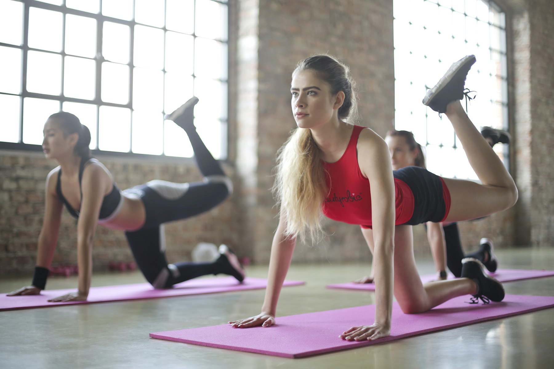
Warm-up
Fifteen minutes of joint prep and breathing. Nobody is left behind.
Main block
Forty minutes of coached lifting or conditioning, scaled to you.
Cool-down
Ten minutes of mobility work you can repeat at home.
Interactive preview. Concept interaction — no booking is made. Resize the window or switch device to see responsive behaviour.
What we set out to solve.
Fitness websites sell transformation before they sell anything concrete. The result is a page of inspiring photography with no answer to the only question a new visitor has: when can I actually come? This concept leads with the timetable, the coaches and the honest descriptions of what a class feels like.
- 01
Timetable first
The week is visible on arrival. Filters for class, coach and intensity, with a clear remaining-places indicator.
- 02
Human photography
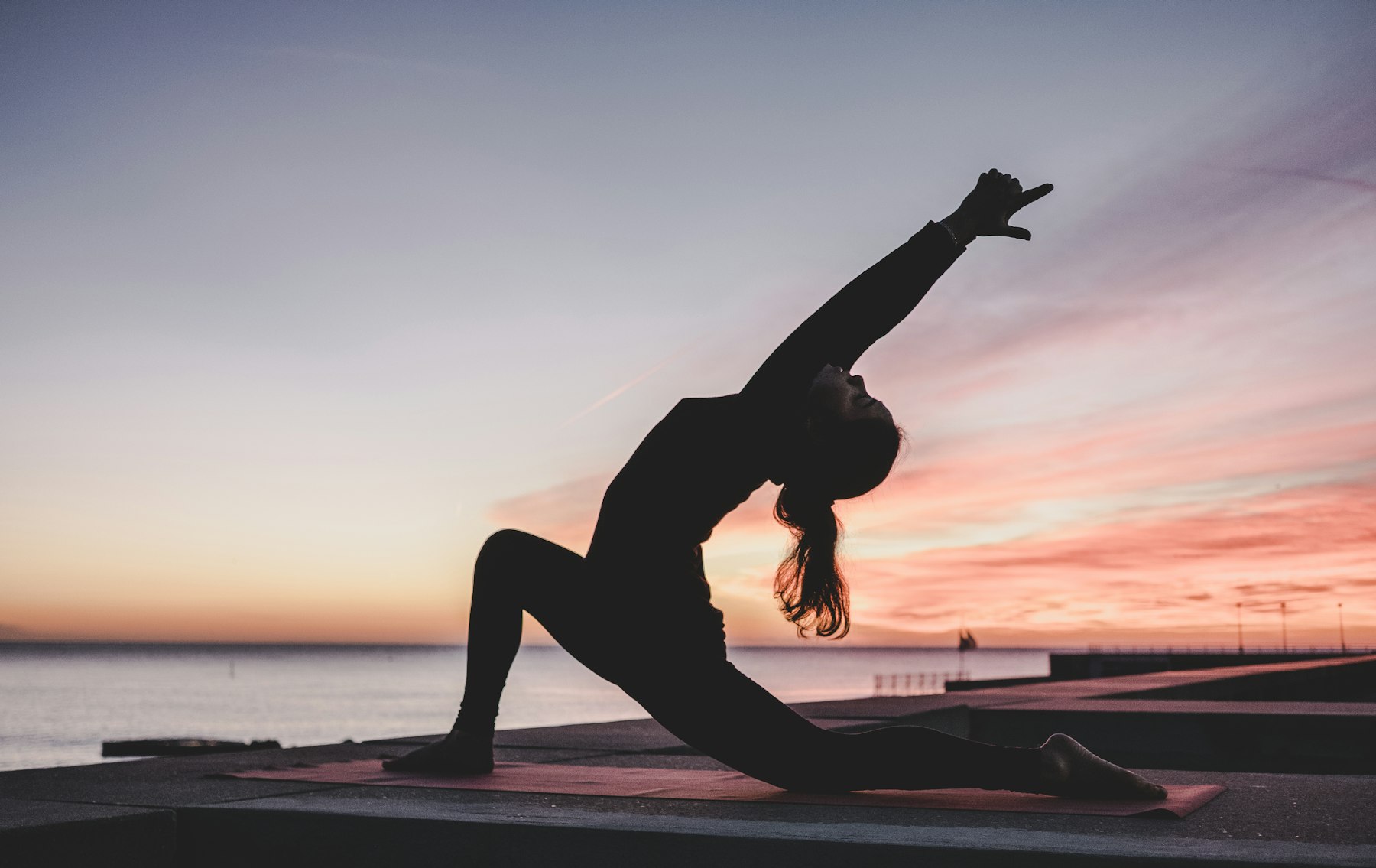
Real bodies, real effort, warm daylight. Photography that shows the room instead of a promise.
- 03
One-tap trial
The free trial asks for a name, an email and one class. Nothing else until they are in the door.
Warm, open, bright
A soft off-white ground with terracotta and ink. The site feels like the studio: light, warm, unpolished in the right way.
Soft serif headlines
Fraunces gives warmth and personality without drifting into gym-bro shouting.
Accessible by default
Large hit areas, high contrast, full keyboard operation — a wellness brand should be usable by everyone.
- 01
See the week
Today's classes at a glance.
- 02
Pick a class
Coach, level and duration.
- 03
Claim a trial
Two fields and a class choice.
- 04
Turn up
What to bring, where to park, what to expect.
Photography, palette and type.

- Ground#F7F3EC
- Surface#FFFFFF
- Ink#1C1A17
- Accent#C15F3C
Display — Peak Wellness
Body — set for comfortable reading at every breakpoint, with a measure that keeps line length in check.
Technical labels